Reimagining the AT Transport app - for a 6 year old!
- Emma

- Mar 26, 2021
- 3 min read
This design challenge was a UX/UI challenge in which we had to create a design sprint which planned out how we would complete this project, as well as prototype the app using Figma. We were tasked with reimagining the Auckland Transport app for our 6 year old selves. Test my final prototype here!
Design Sprint
The design sprint is a plan which you create to step out the task and track your time management on the project.
Step 0 - Assumptions
Assumptions were made to help decide on specific features e.g that the child can read, as when I was 6 I was able to read simple words and sentences, recognize familiar street names.

Step 1 - Precedents
I gathered some precedents based on what I wanted to achieve based off my assumptions. My main goal was to make the app fun and comforting as I was very afraid of public transport when I was younger.

I also created a mood board to gather some inspiration around colours, shapes, and app functions.

Step 1.5 - Risks
Step 1.5 identifies gaps in your knowledge, and other problems you may face during the design process. I allocated myself an hour to learn Figma, however it was an incredibly intuitive website and I caught onto it very quickly and only need a 20 minute tutorial.
NOTE: During this stage I didn't realise we were just prototyping an app and didn't have to create a logo, so risk 3 is redundant.

Step 2 - Ideation
I ideated some ideas for different pages as well as backgrounds. I allocated myself 1.5 hours to do this, but it actually took my 2 hours to complete these ideations as I was struggling a lot to come up with ideas and having a bit of a block. I found that taking a break for a couple days and coming back to it helped a lot as well as drawing much smaller ideations, rather than the big, detailed ones I started doing in the beginning.


Step 3 - Chosen Ideations
Here I had to decide on my prototypes. As you will see in my process of building the prototype I actually had a different background idea, and had to come back and rework it, reflecting on this, I should've realised that this background wouldn't work in the beginning and should've gotten feedback at this stage before moving onto the next step. I allocated myself 30 minutes to do this, however it took me 10 minutes in reality as during the ideation process I knew which ideas popped out to me and that I liked.

Step 4 - Build the Prototype
The fun part! I originally took the colours of the AT Hop app and used those, but they were quite boring and after getting some feed back, realised that a child may not find the colours very fun and the app appealing, so I reworked the colours. I also realised the background was very distracting, and made it hard to understand the function, so I reworked that as well, taking another idea from my original ideations. I allocated 3 hours to do this, but with the reworking it took me 5 hours.
My original graphics and colours
My first prototype using my orginal graphics and colours
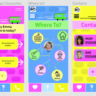
The reworked app, and final prototype.
You can test the app out here.
Step 5 - Commentary
I was able to contact some people I know and get some feedback on how they found the app prototype. I asked for feed back based on the main criteria that I had gathered from my assumptions:
1) Are you able to understand and read the words and sentences on the app?
2) Do you find the app fun? Do you like the colours and graphics?
3) Do you understand how the app functions? Are you able to use it on your own?

I allocated myself 2 hours to do this, but it actually only took around 30 minutes.
Step 6 - Reflection
The last step is to reflect upon this task and explain what I learned and would do different next time. These reflections are a seperate blog which you can find on my blog page.
Statement of Intent
I decided the most important features of the app were a favourites page, a ‘where to?’ page, and a contacts page. These are what I would need as a child to use public transport. I had a huge fear of buses when I was younger, so to make the experience better, the app has fun colours, across the pages, as well as bus graphics in the background. I included a feature in which you can see who the driver is before you catch your bus to help you feel more comfortable on the bus.


Comments